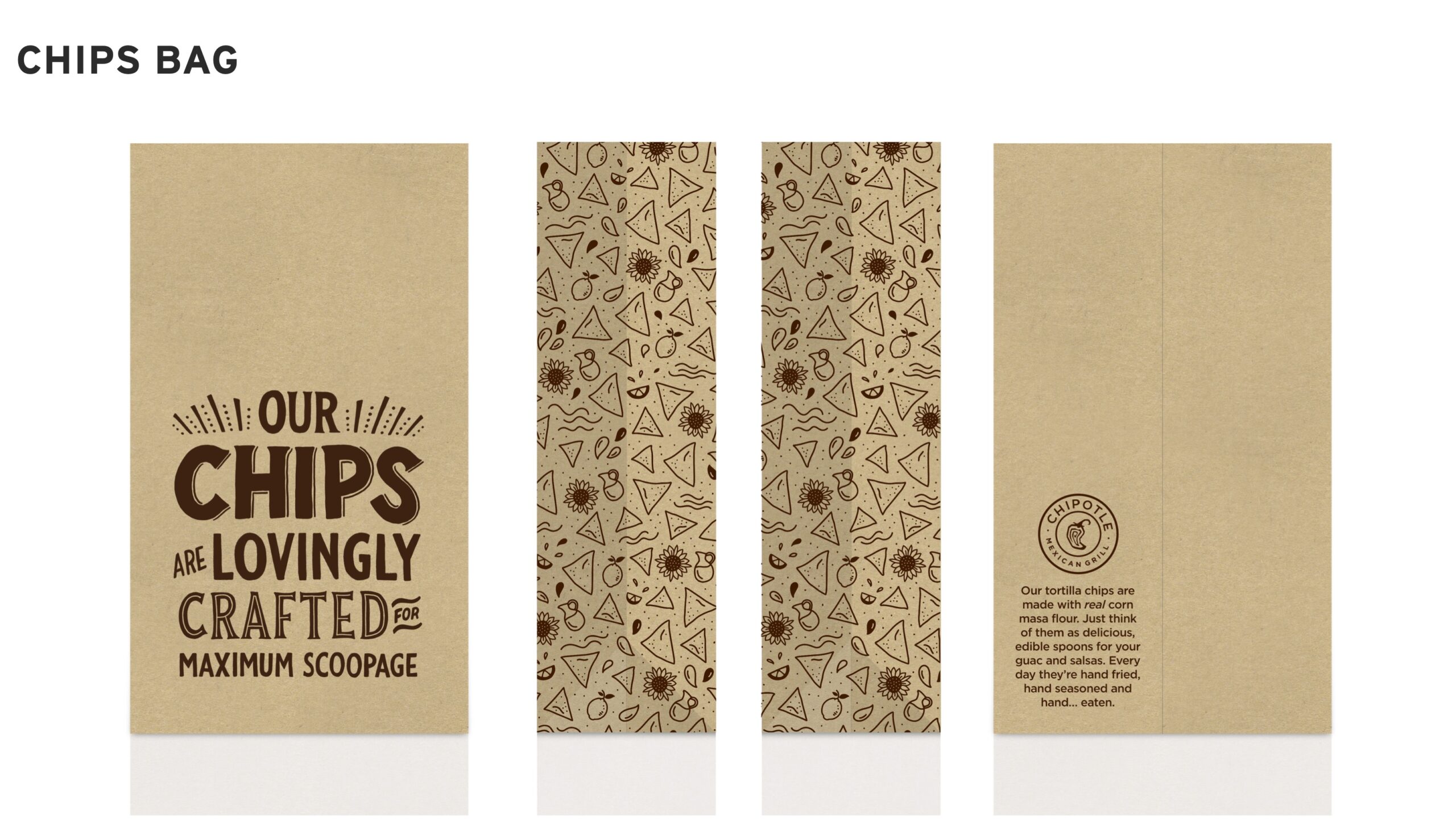
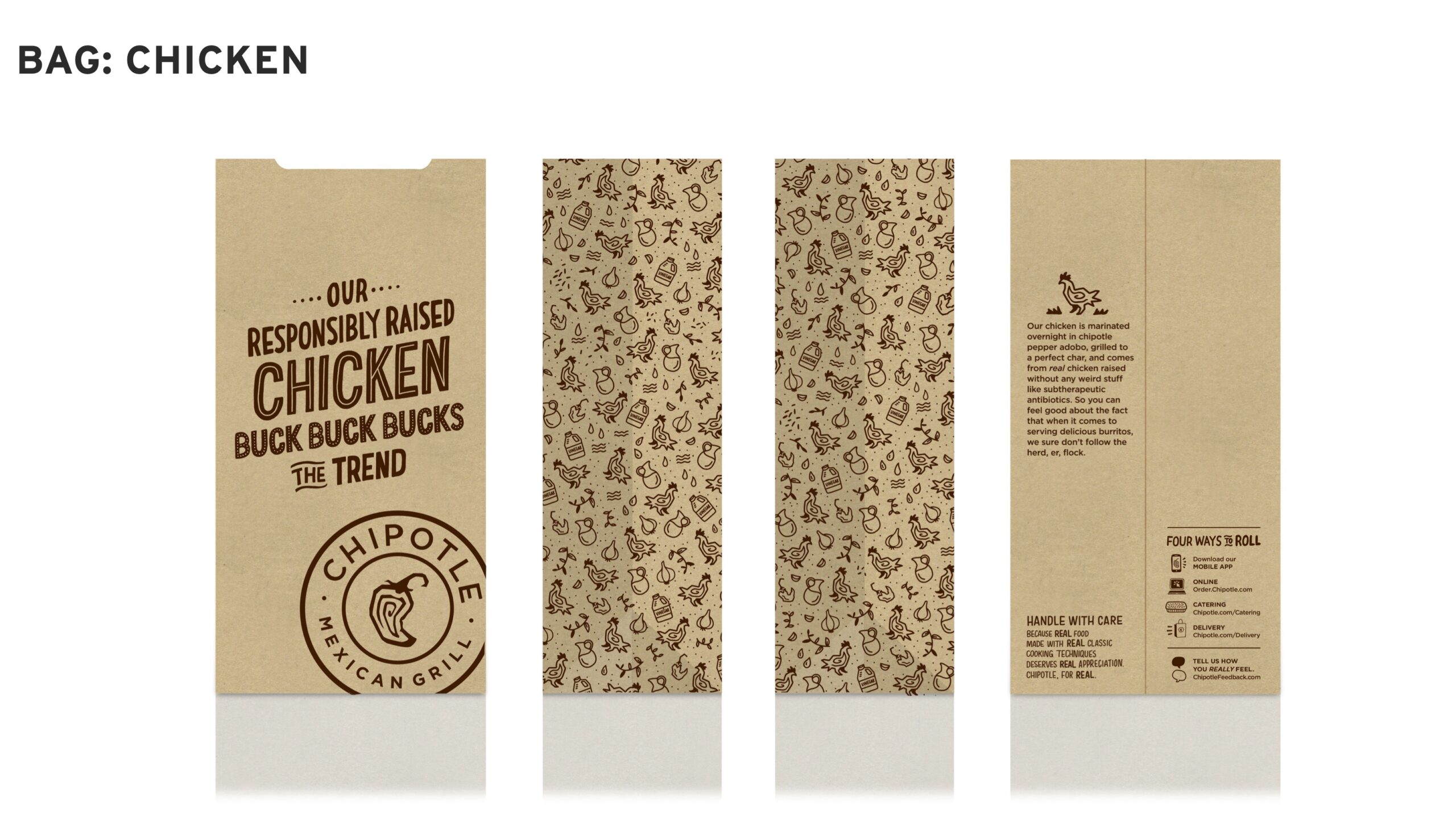
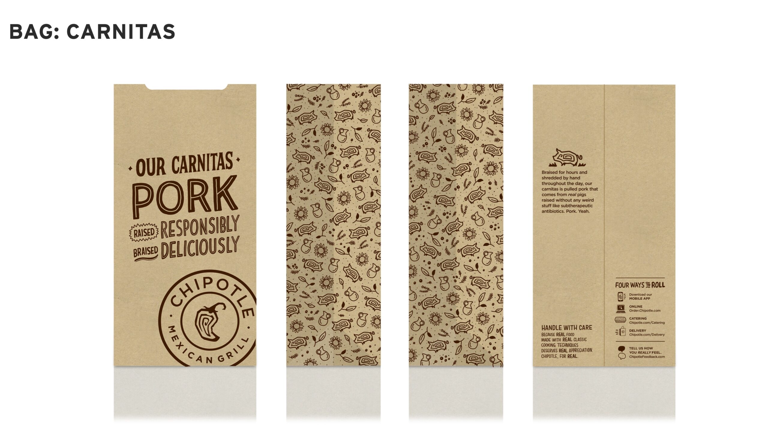
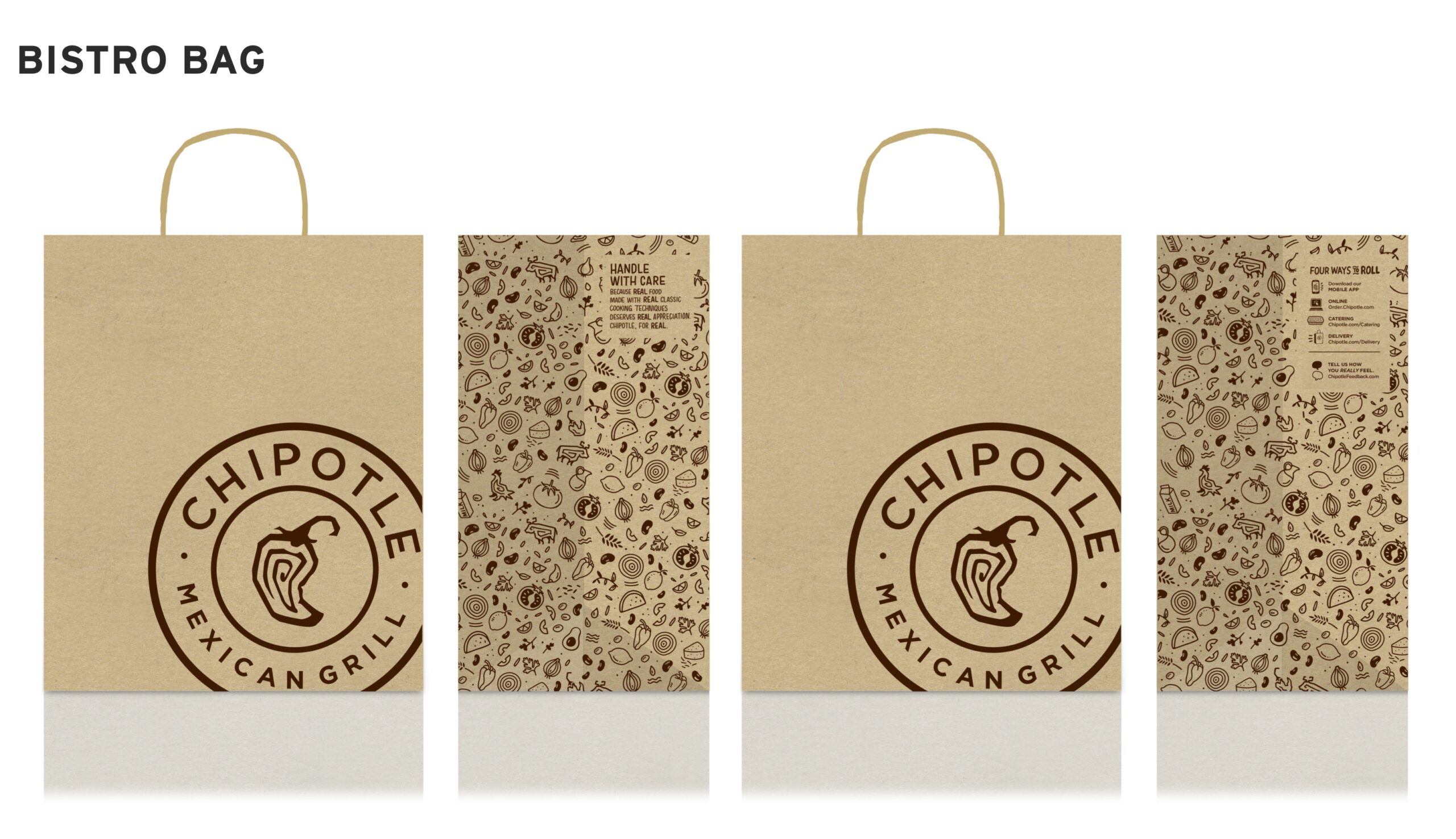
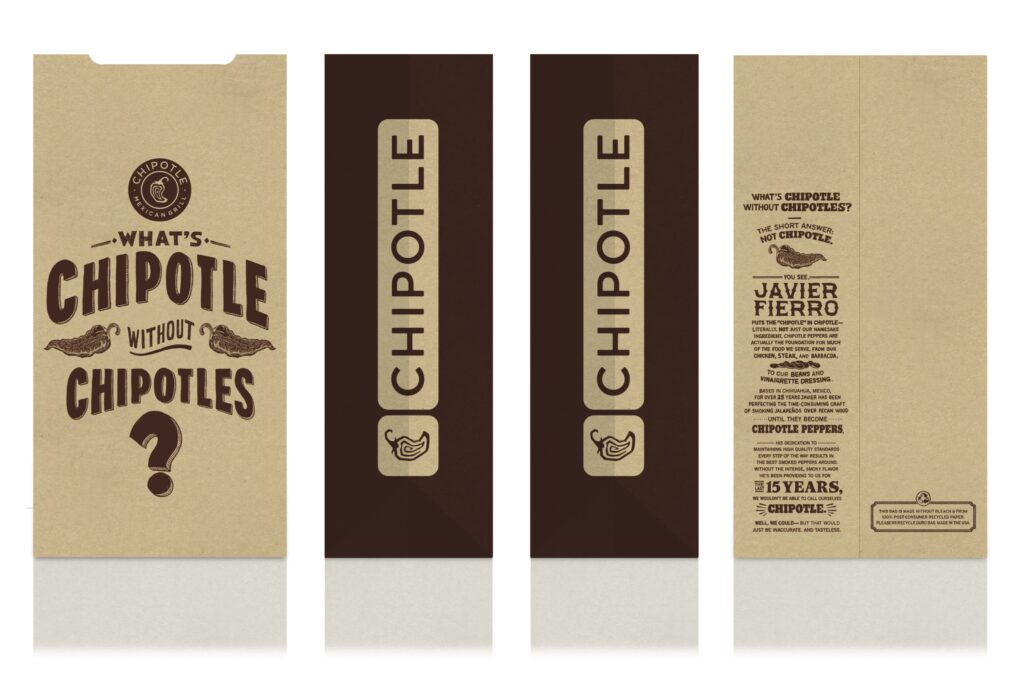
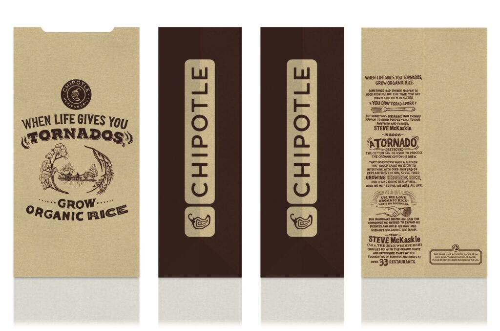
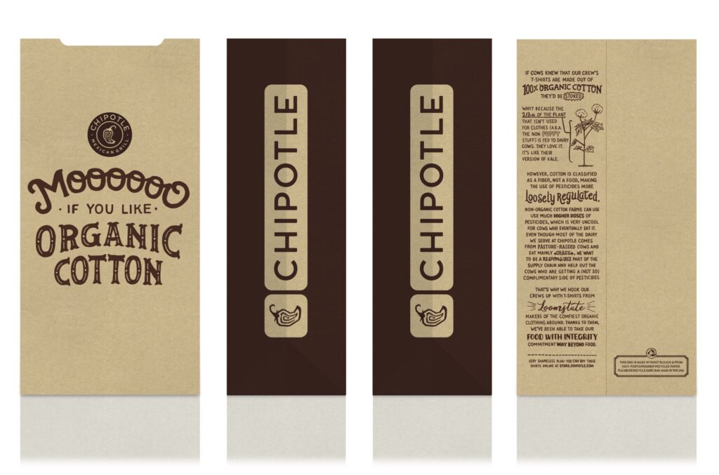
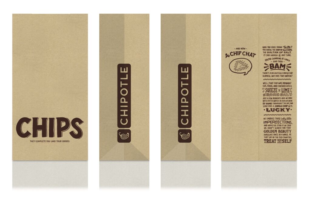
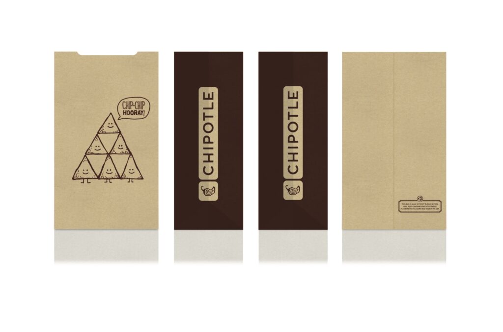
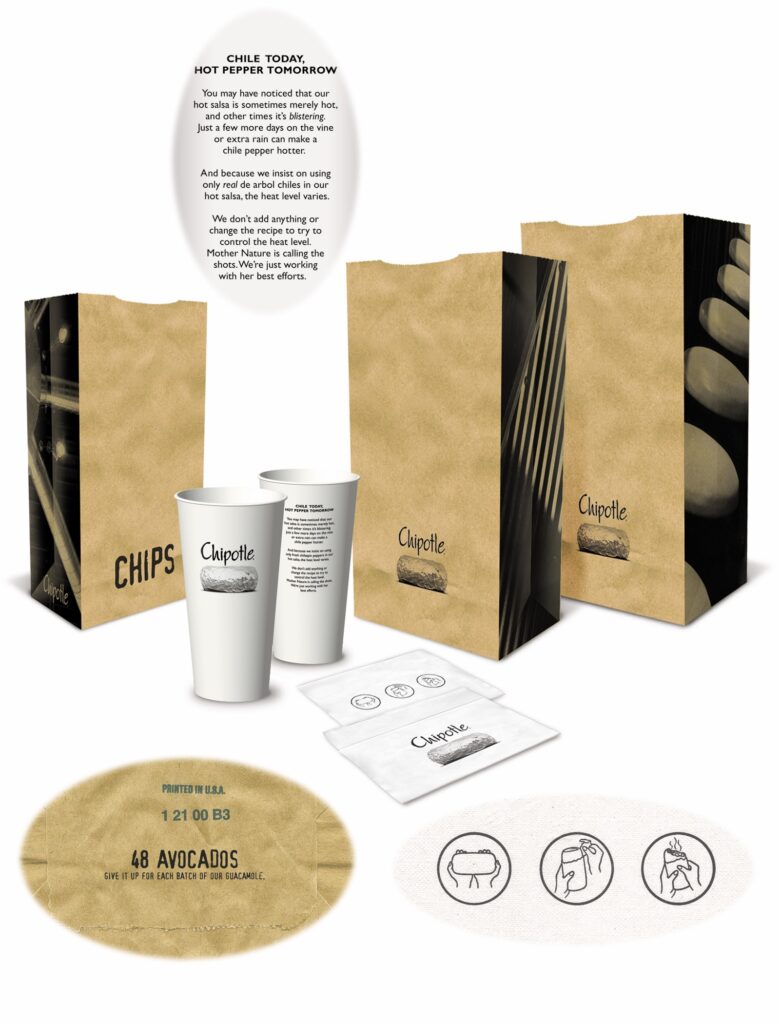
Packaging should always be seen as multi-purpose. First and foremost it needs to simply be physically functional, getting the customer’s meal from the restaurant to wherever they’re going with the least amount of hassle. Secondly, the fact that it’s leaving the restaurant allows for it to become it’s own little walking billboard, putting the restaurant top-of-mind with everyone it passes (and also gaining the implied endorsement by the customer carrying it). And finally, it can take advantage of the pause that a meal creates, offering more profound messaging to entertain and educate the customer as they enjoy their meal.
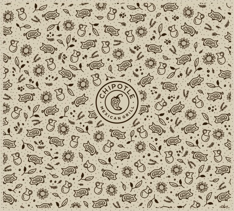
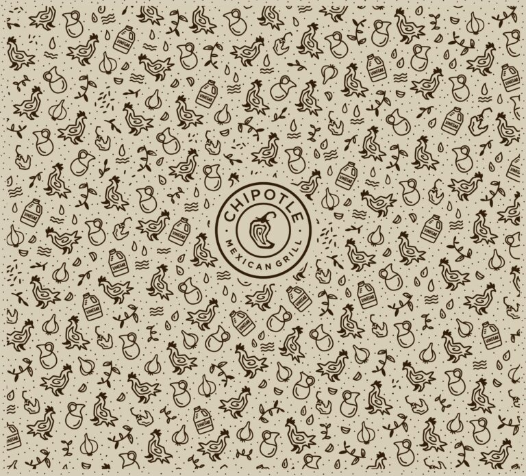
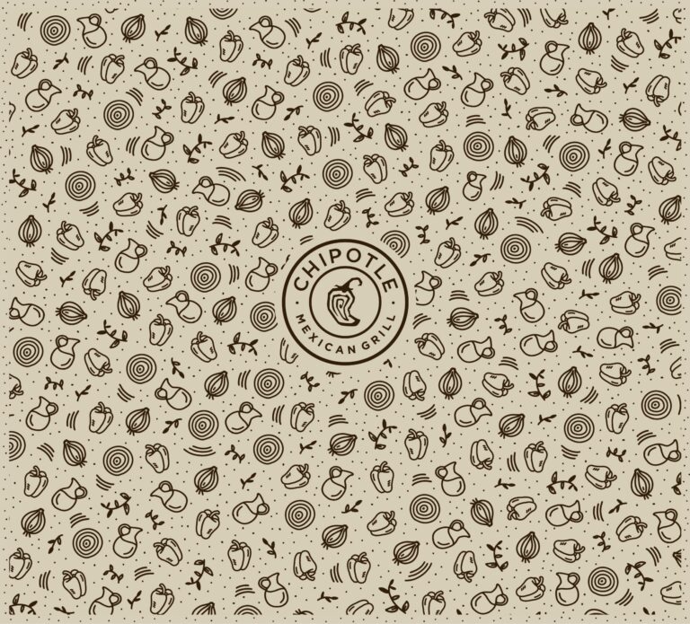
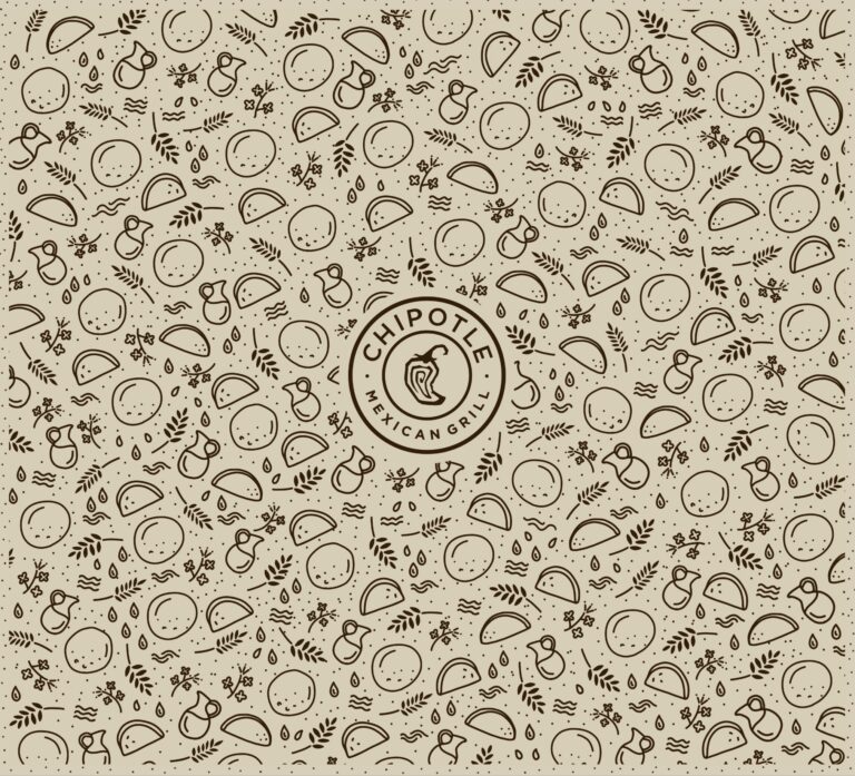
REAL FOOD — 2019
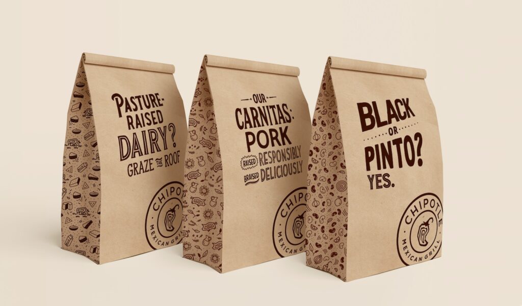
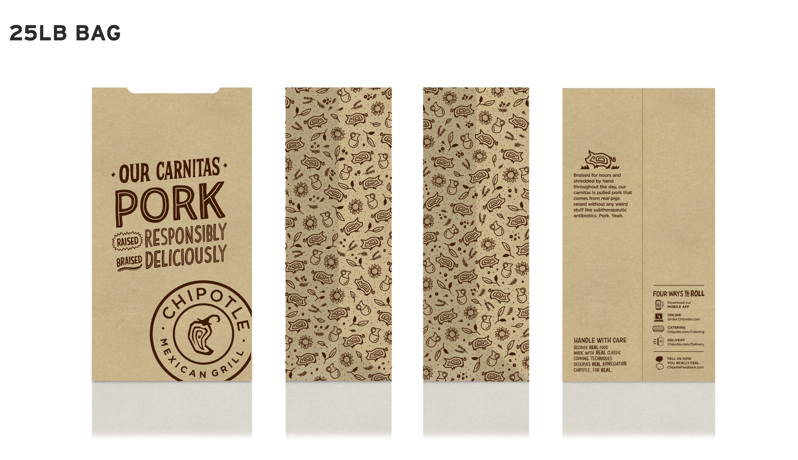
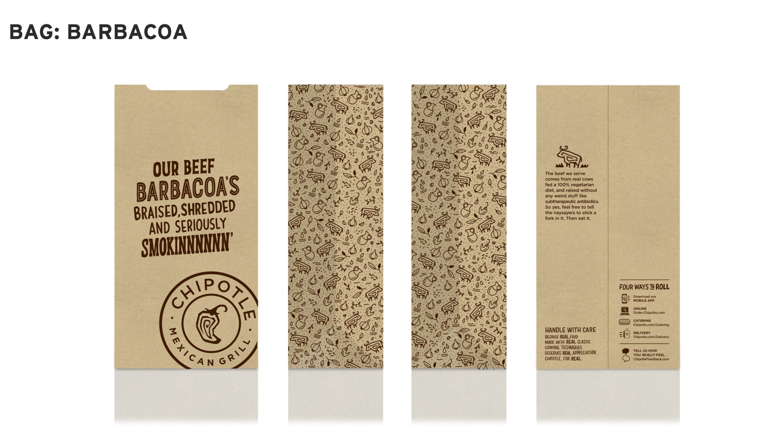
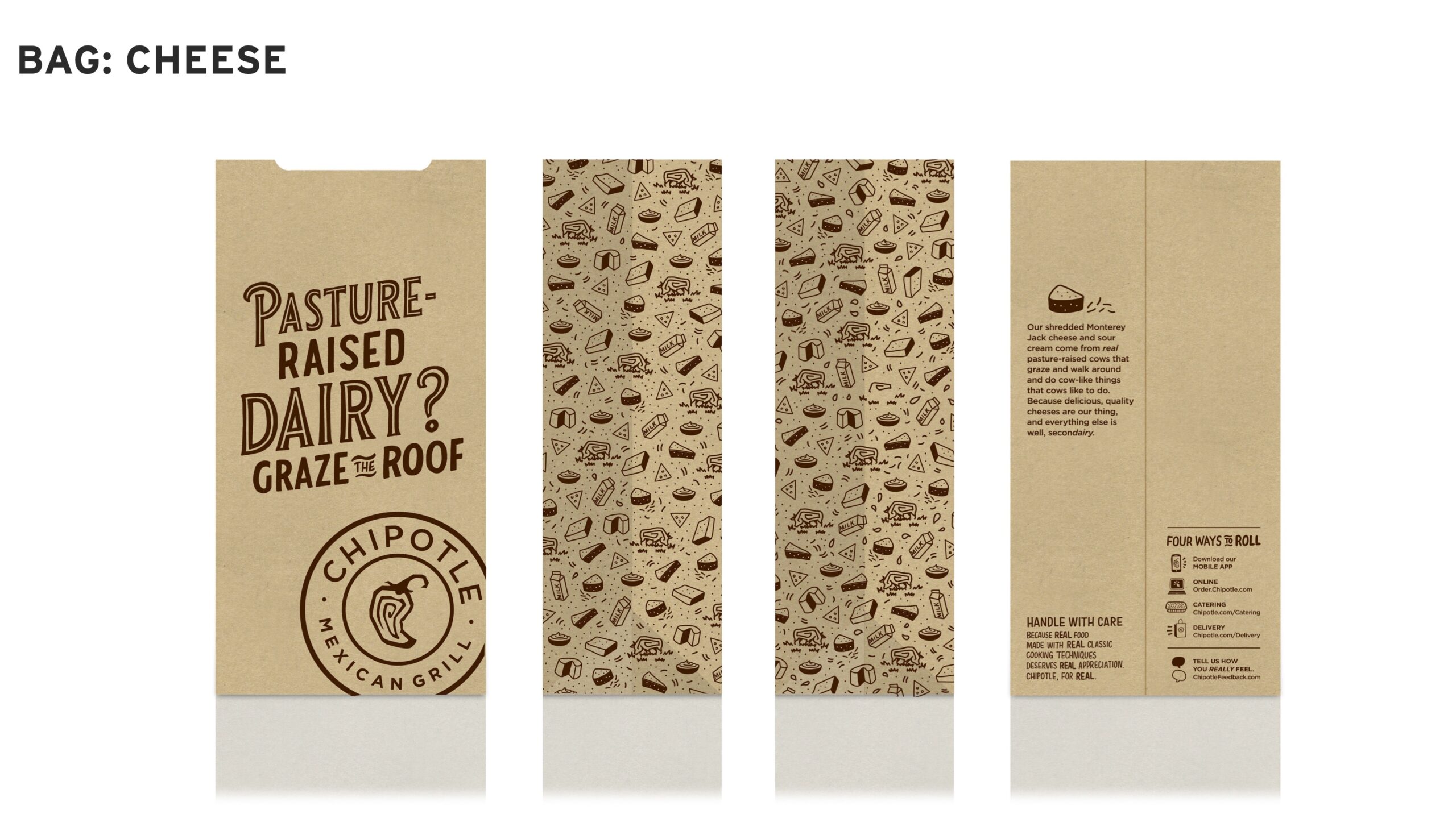
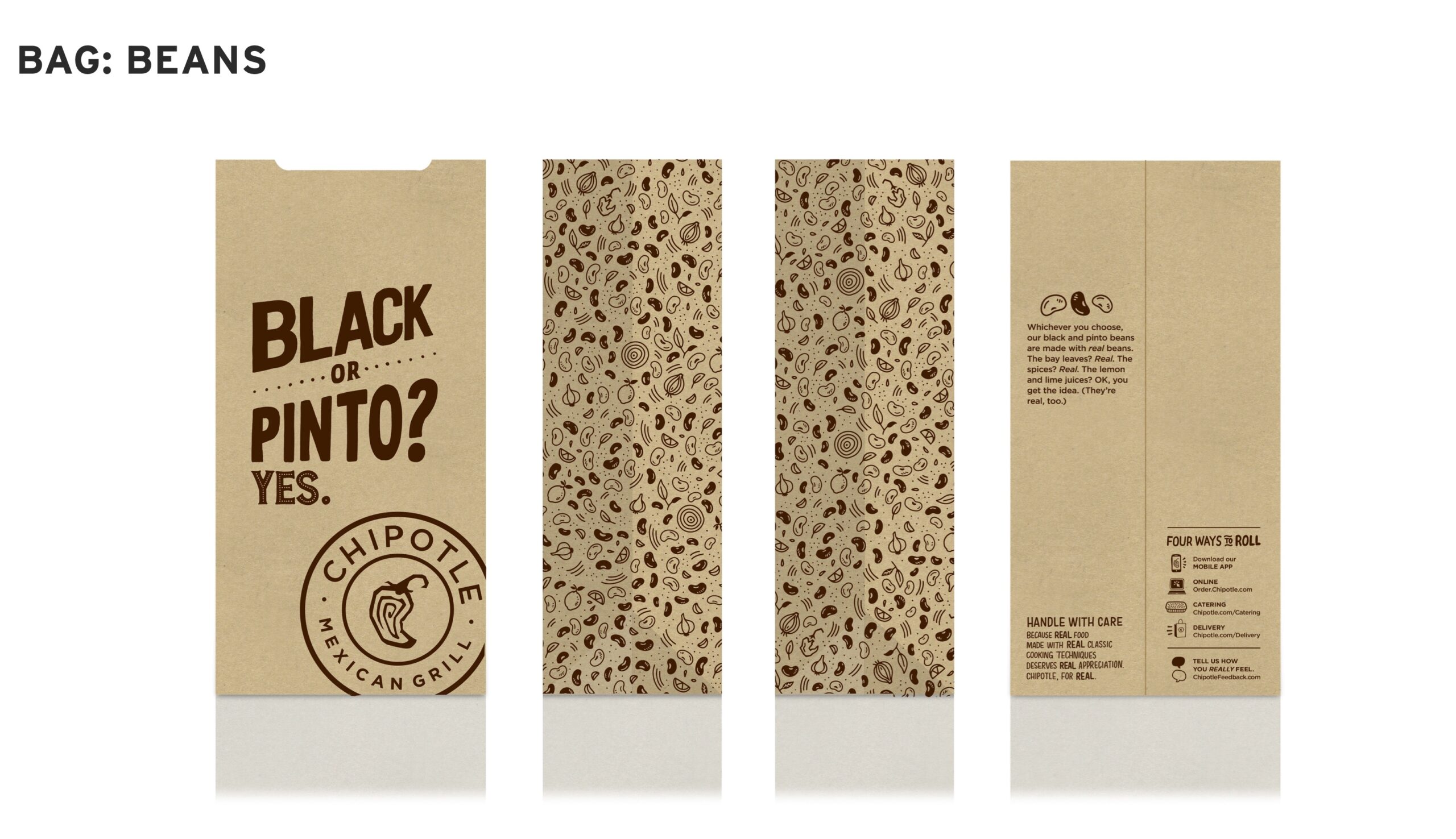
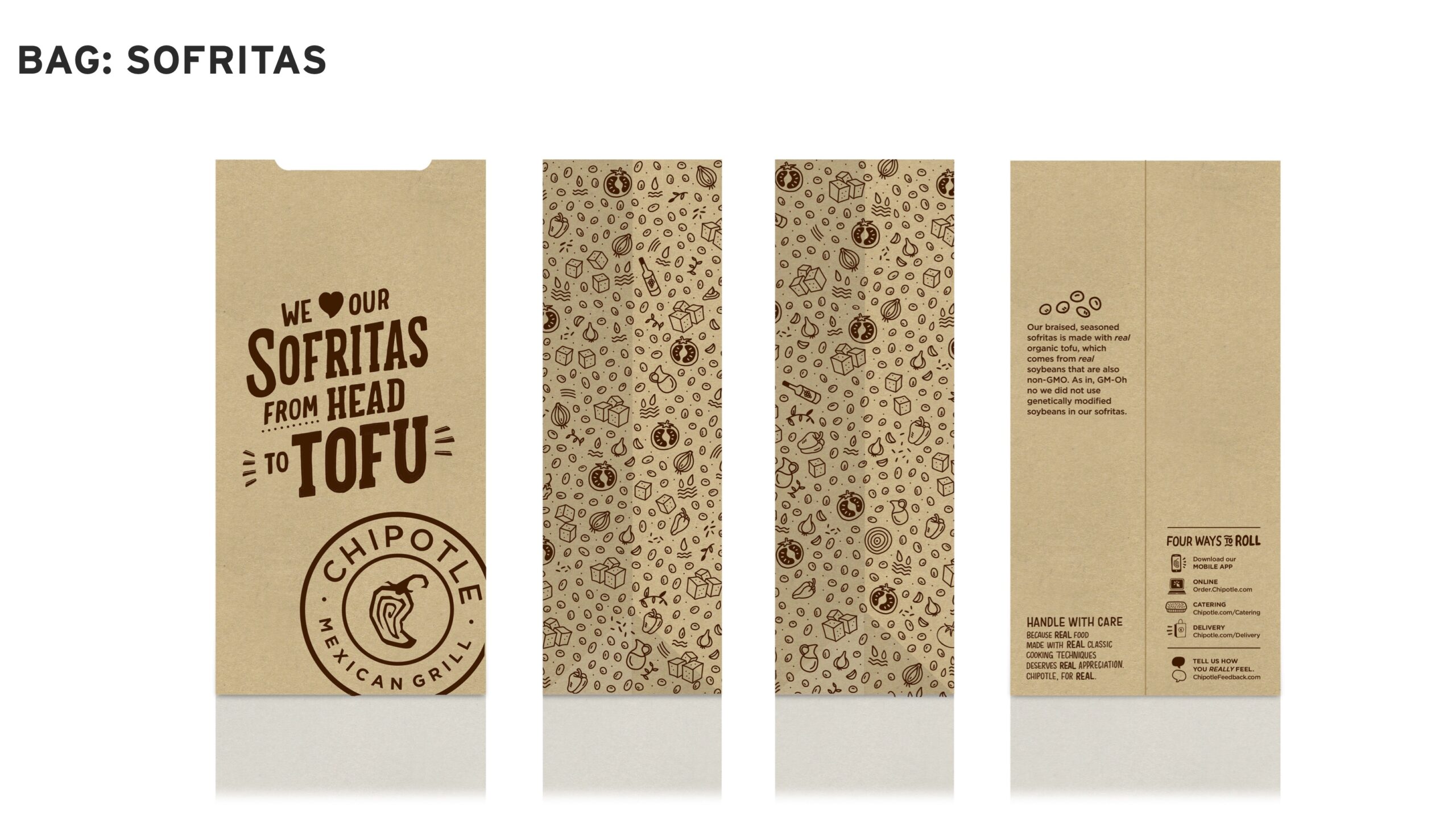
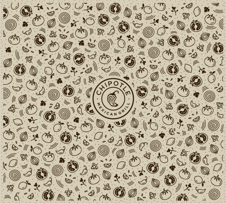
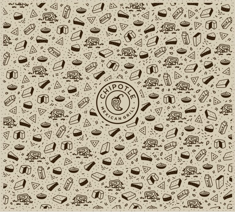
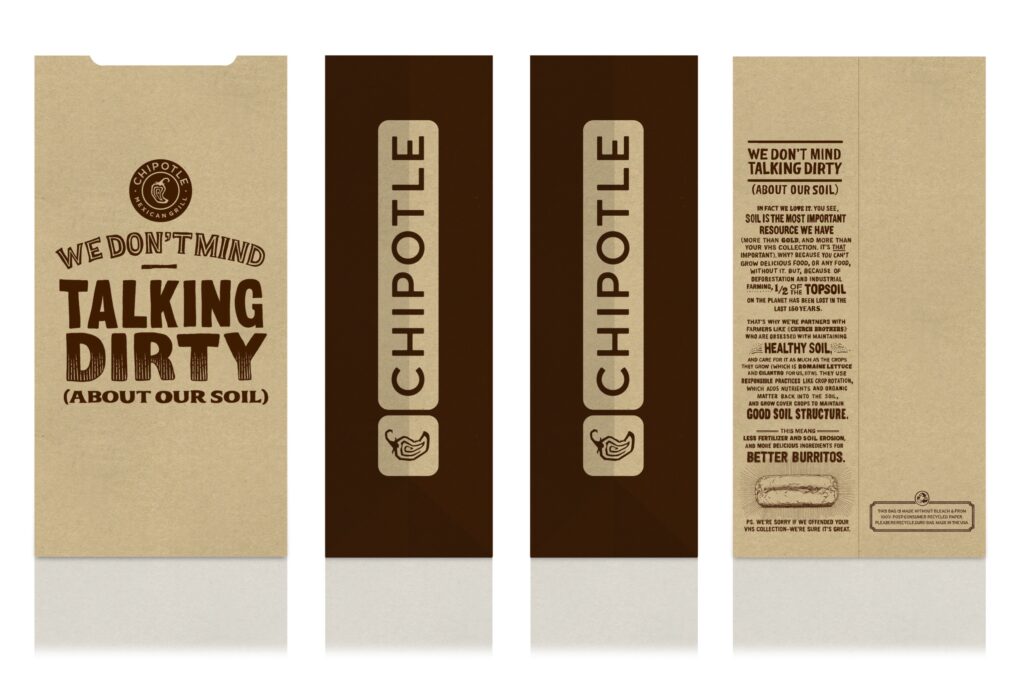
Each piece speaks to Chipotle's real food in a fun, light-hearted, and irreverent way. This series was designed for a quick read, with a bold logo making every bag that left the restaurant an instantly recognizable Chipotle ad.
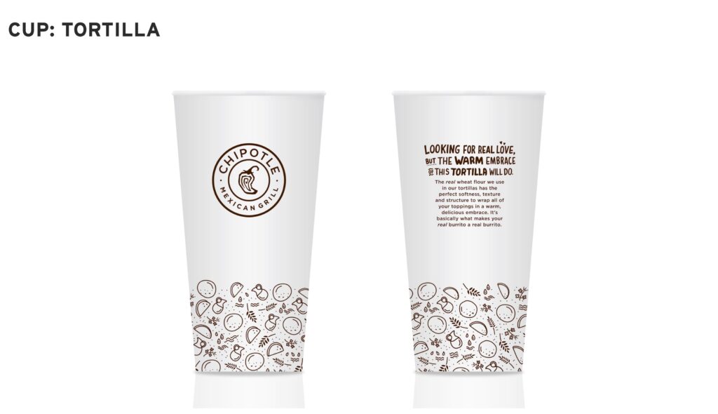
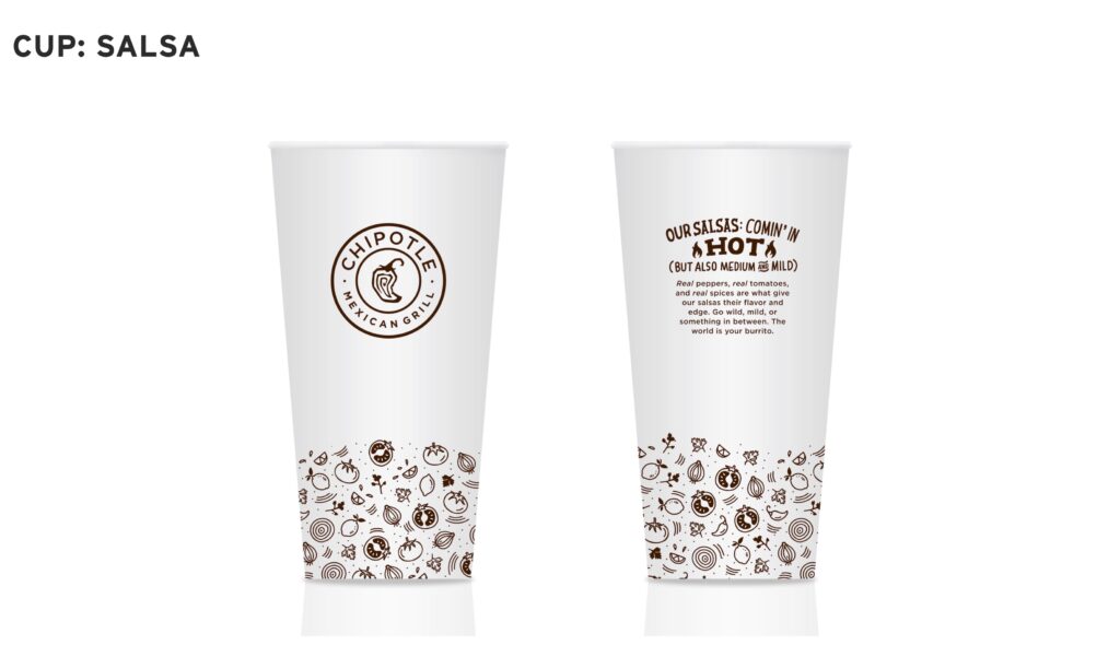
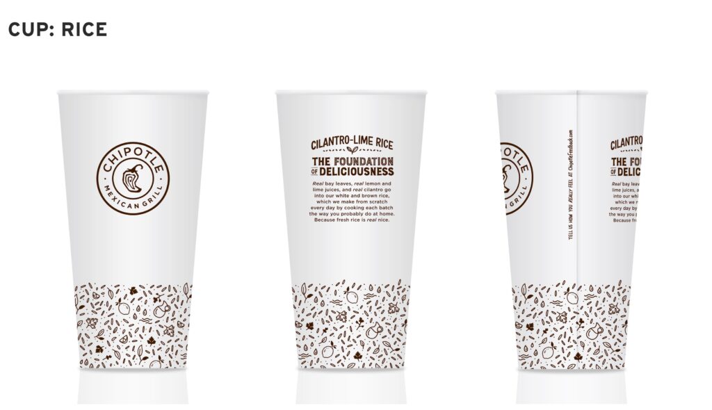
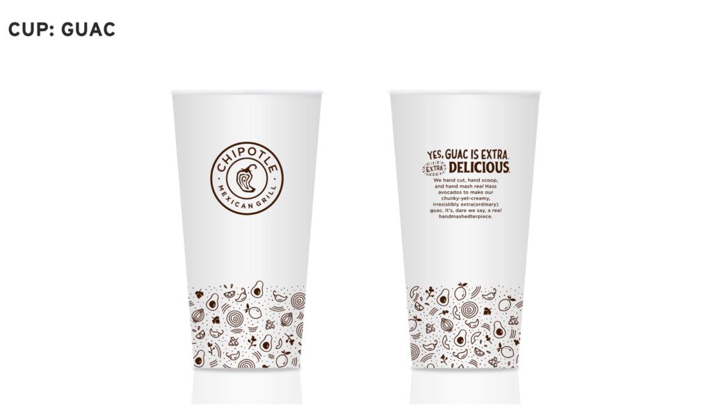
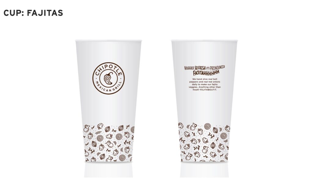
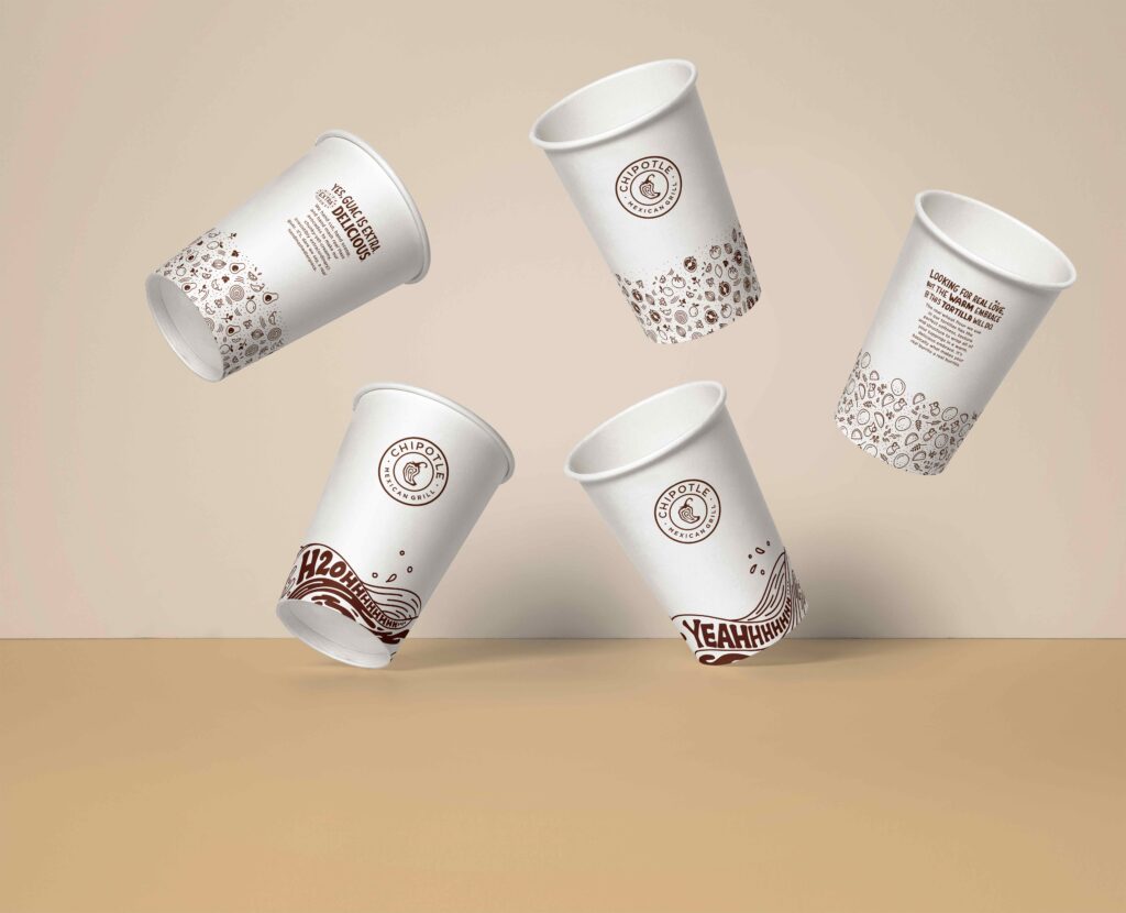
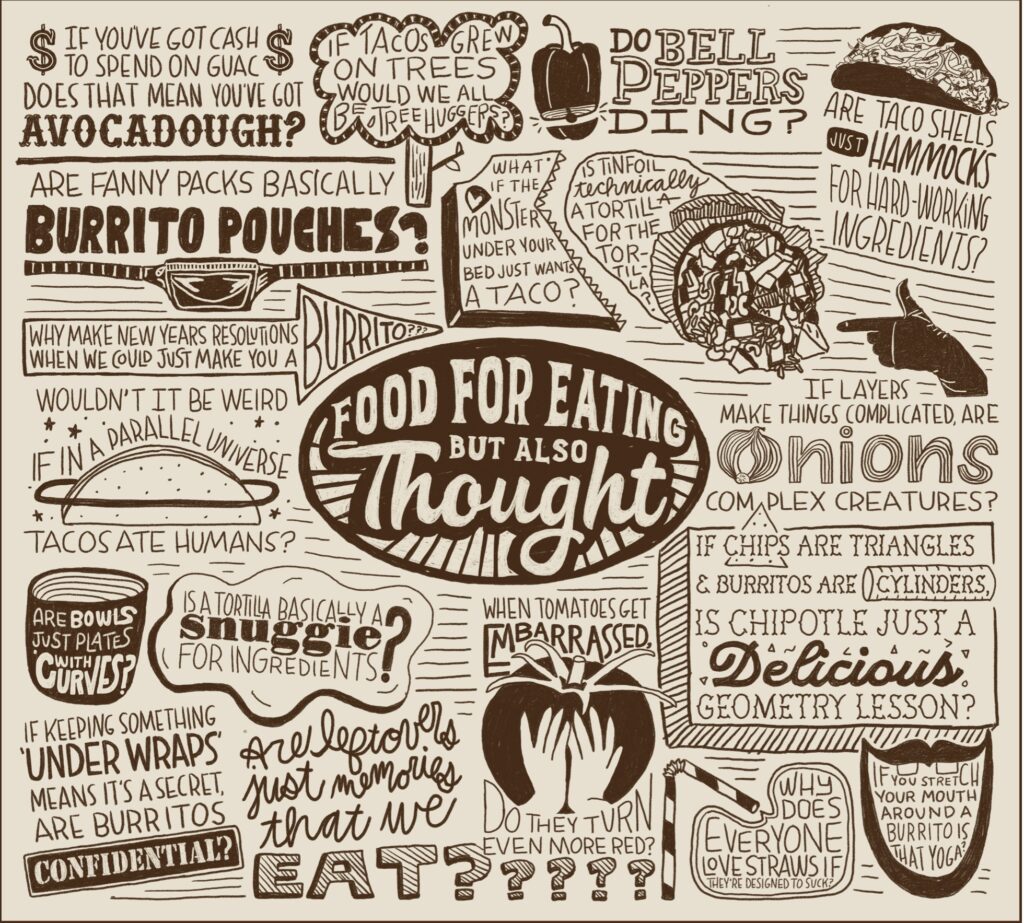
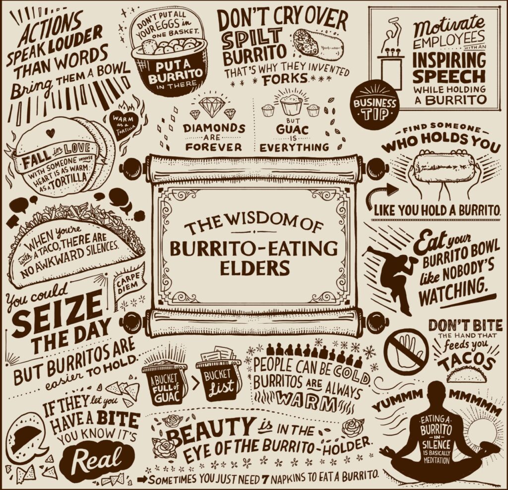
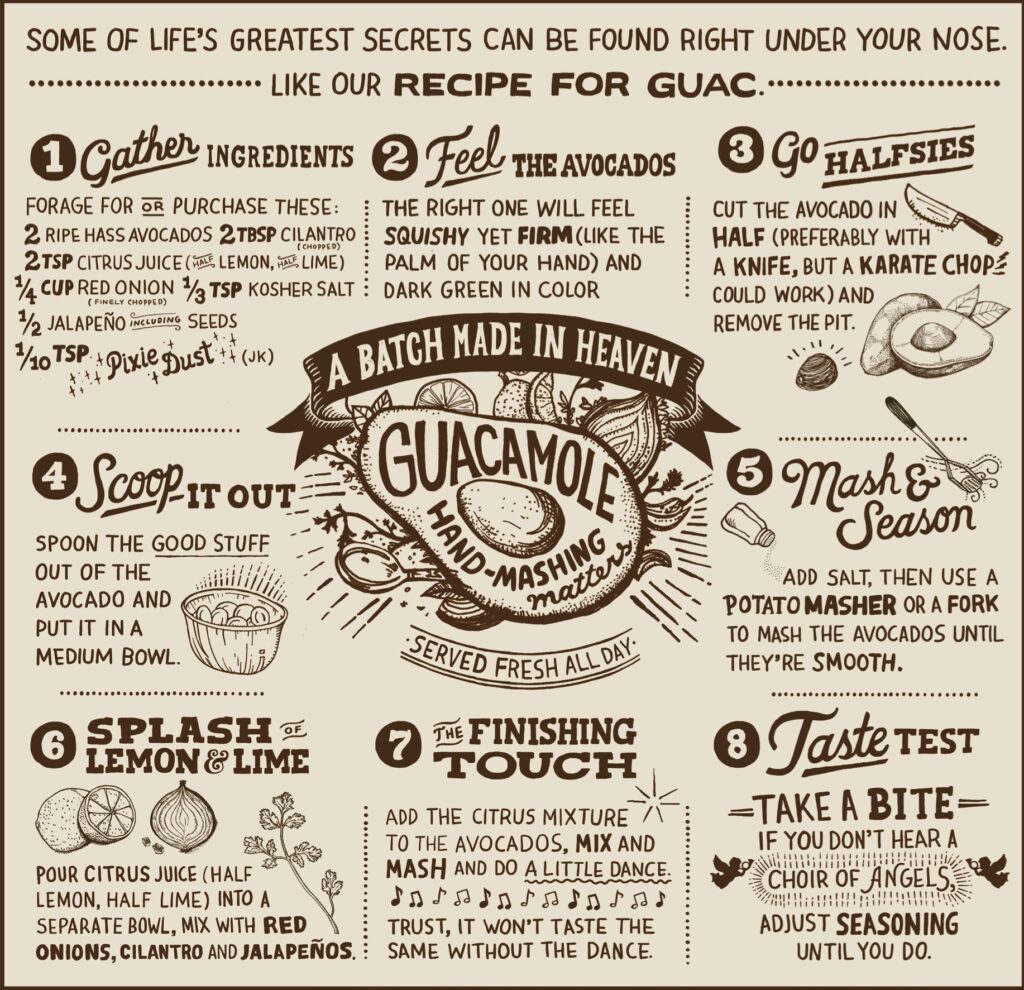
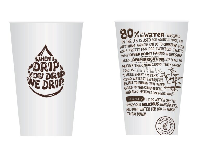
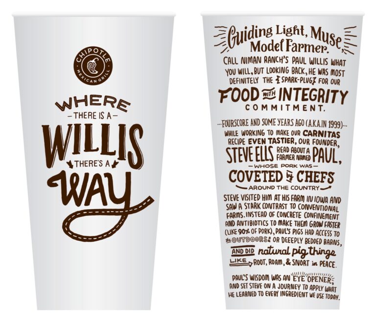
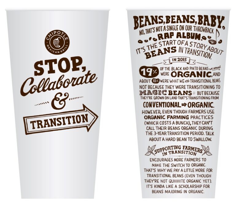
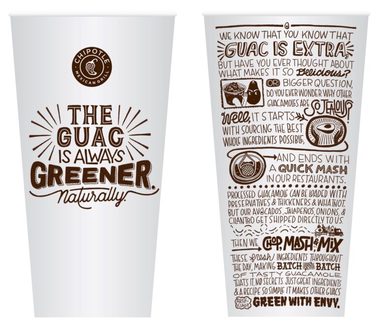
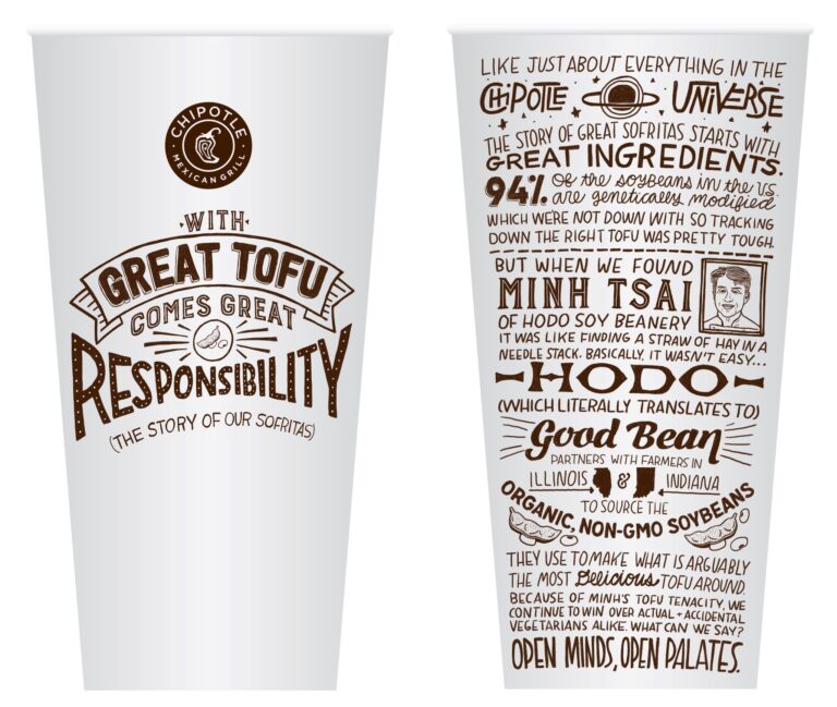
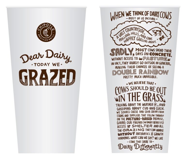
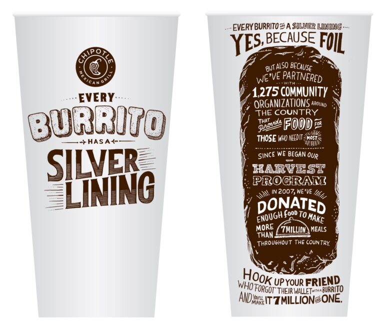
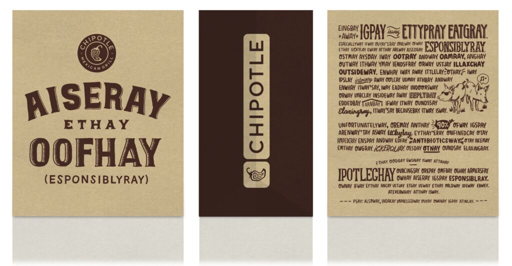
Harkening back to the earlier packaging, these pieces were built around telling longer Food With Integrity stories in a humorous and entertaining way, paired with hand-drawn lettering and quirky images.
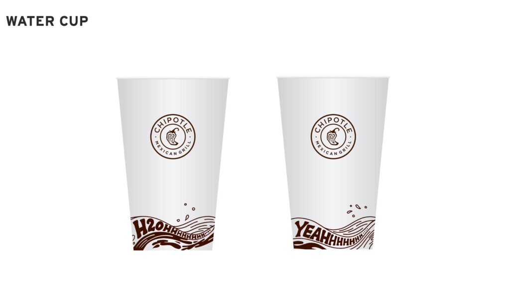
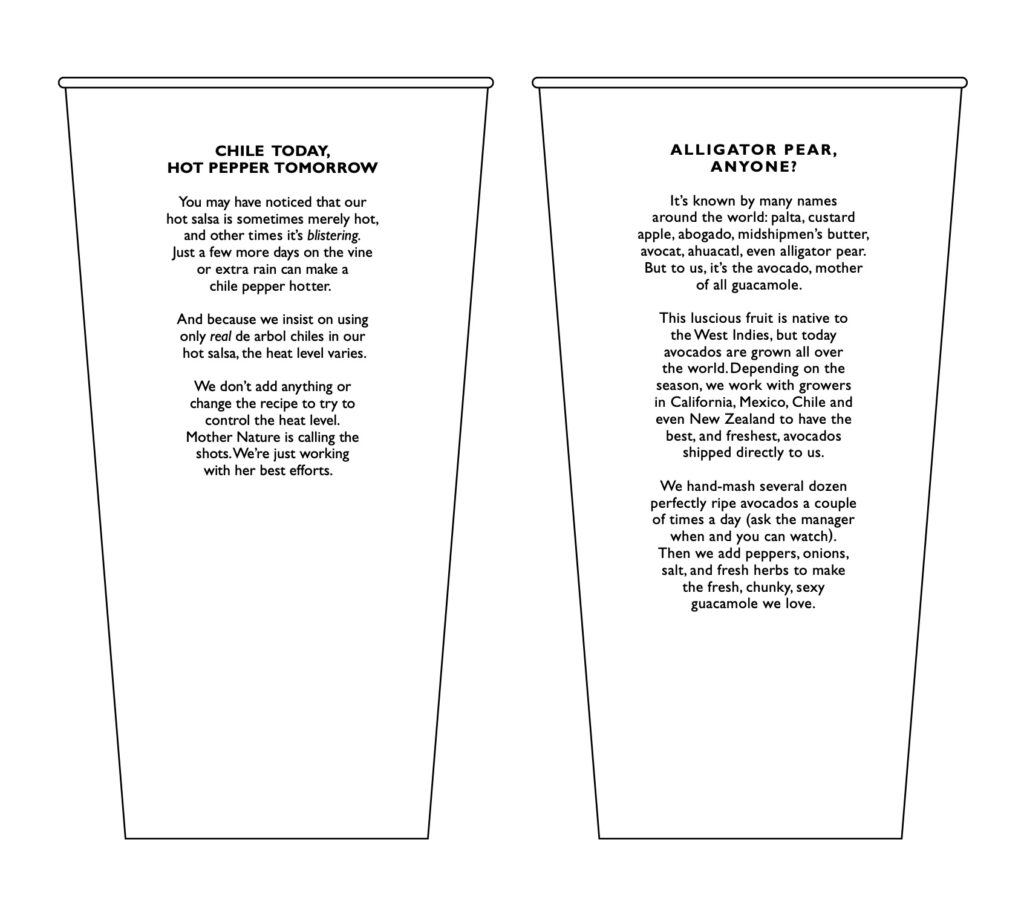
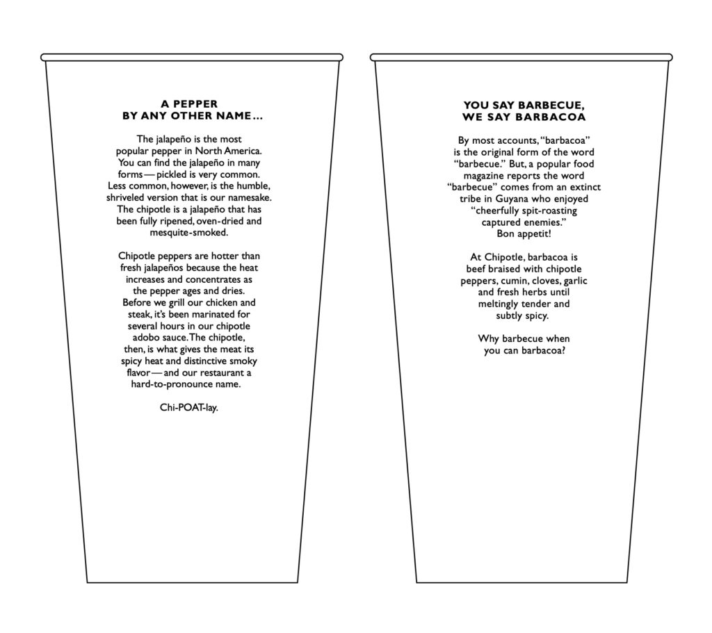
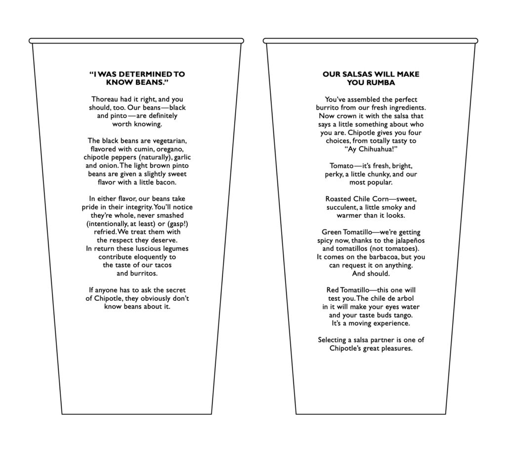
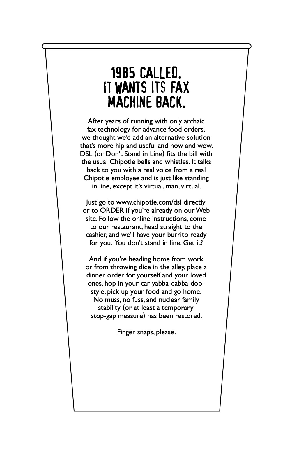
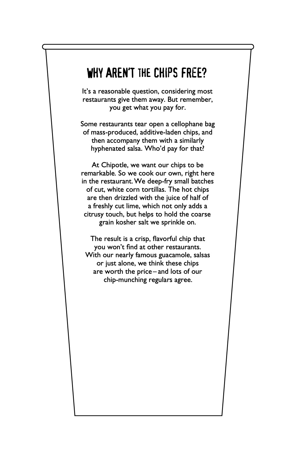
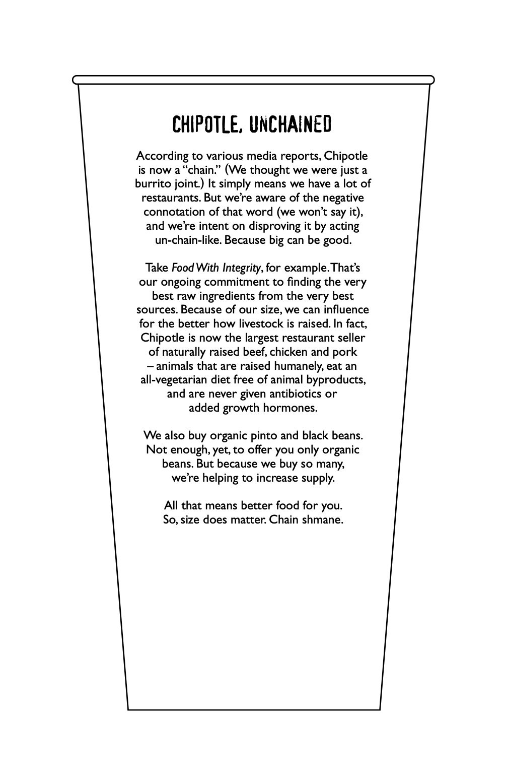
In the way back we kept it really simple with long reads on the cups that gave customers both some information and entertainment as they enjoyed their Chipotle favorites. I've tried to include all the cups from the series here for those who recall them and are in the mood for a little nostalgia.